There is no single Heavy Ink aesthetic.
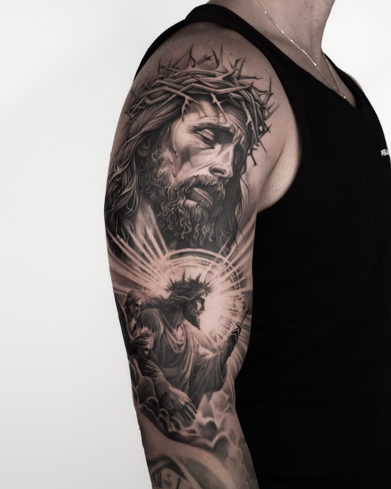
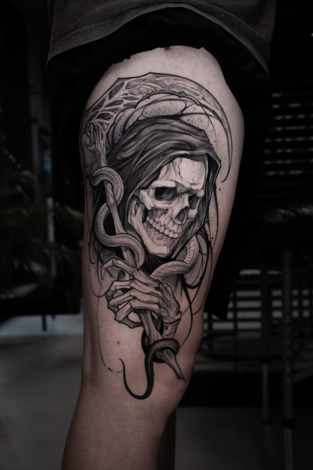
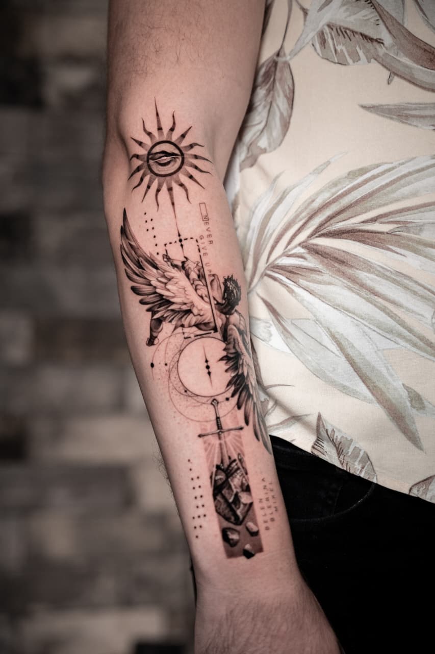
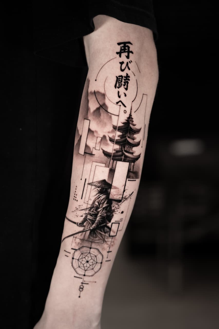
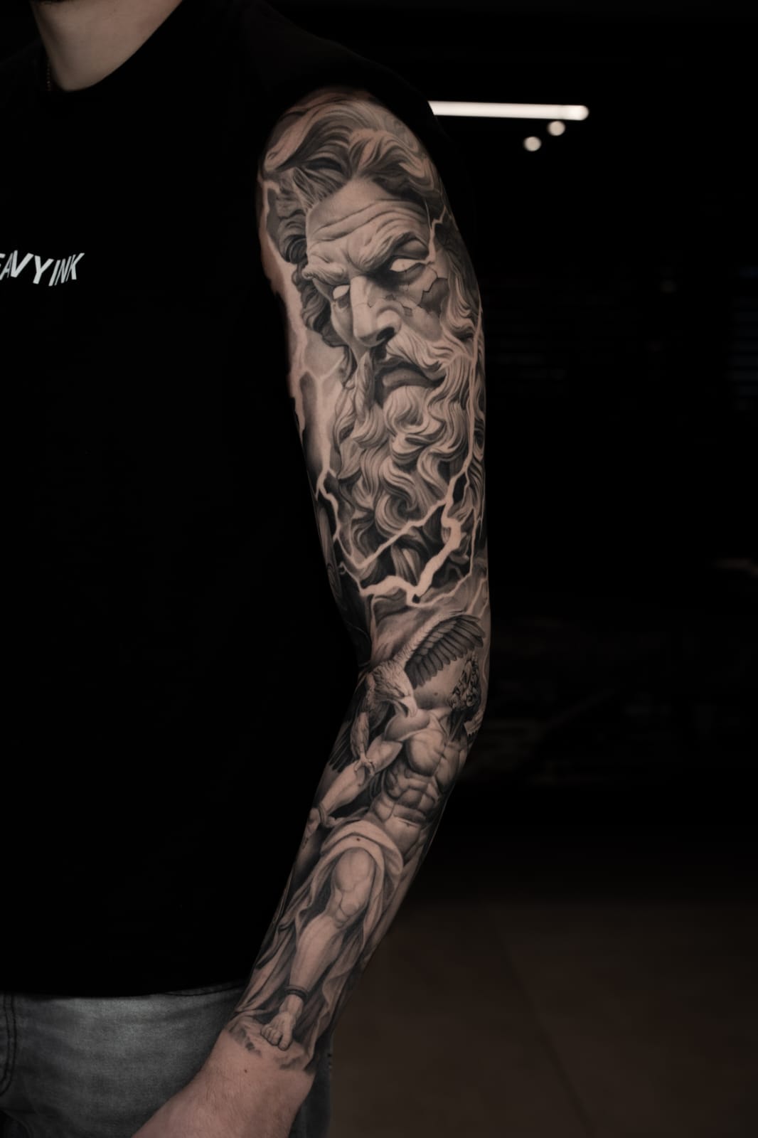
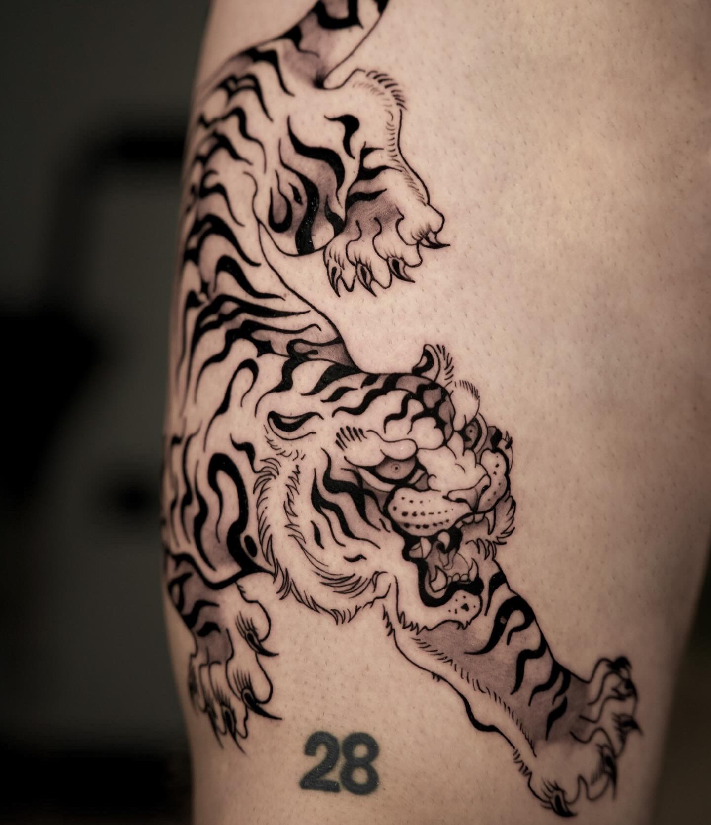
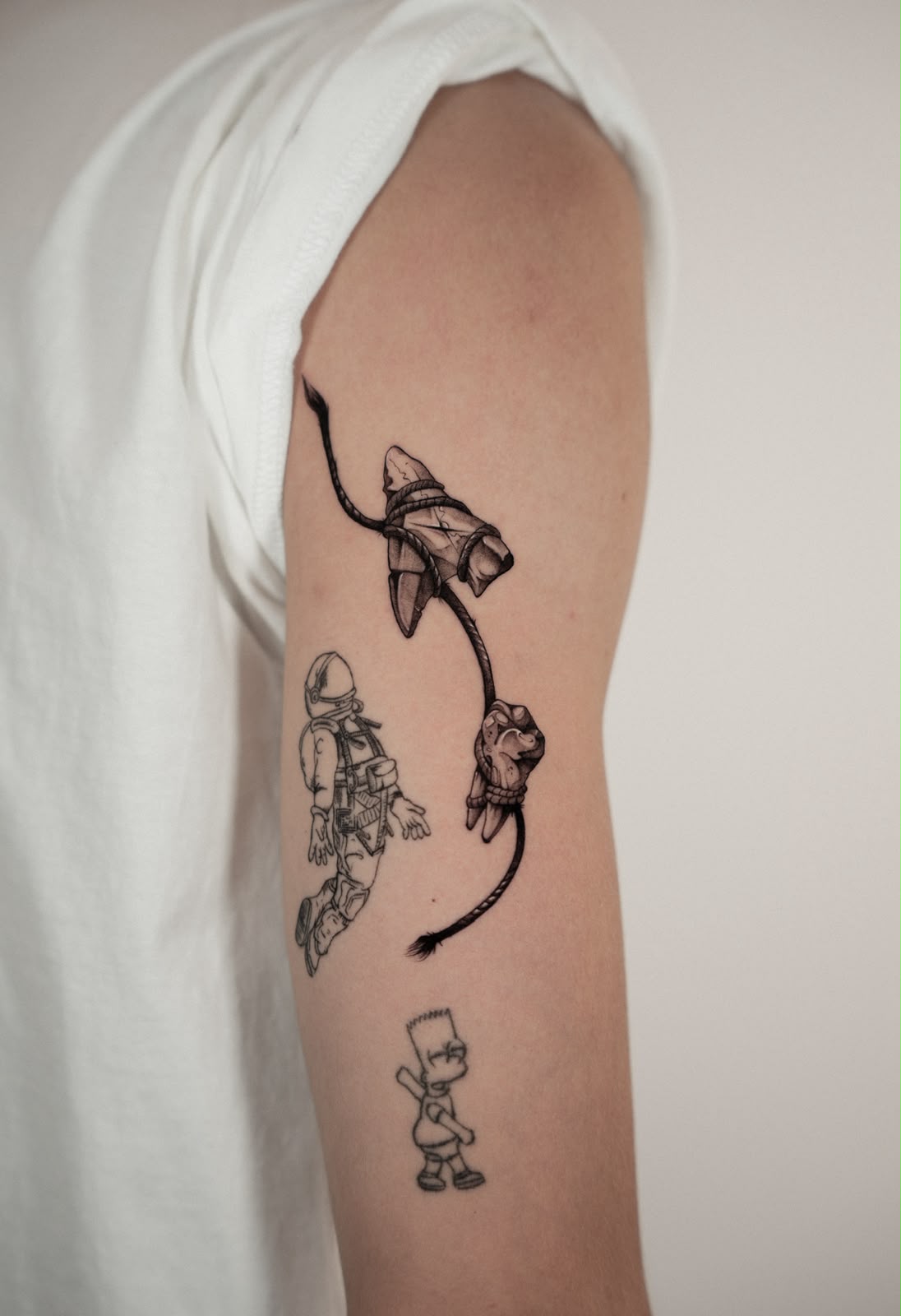
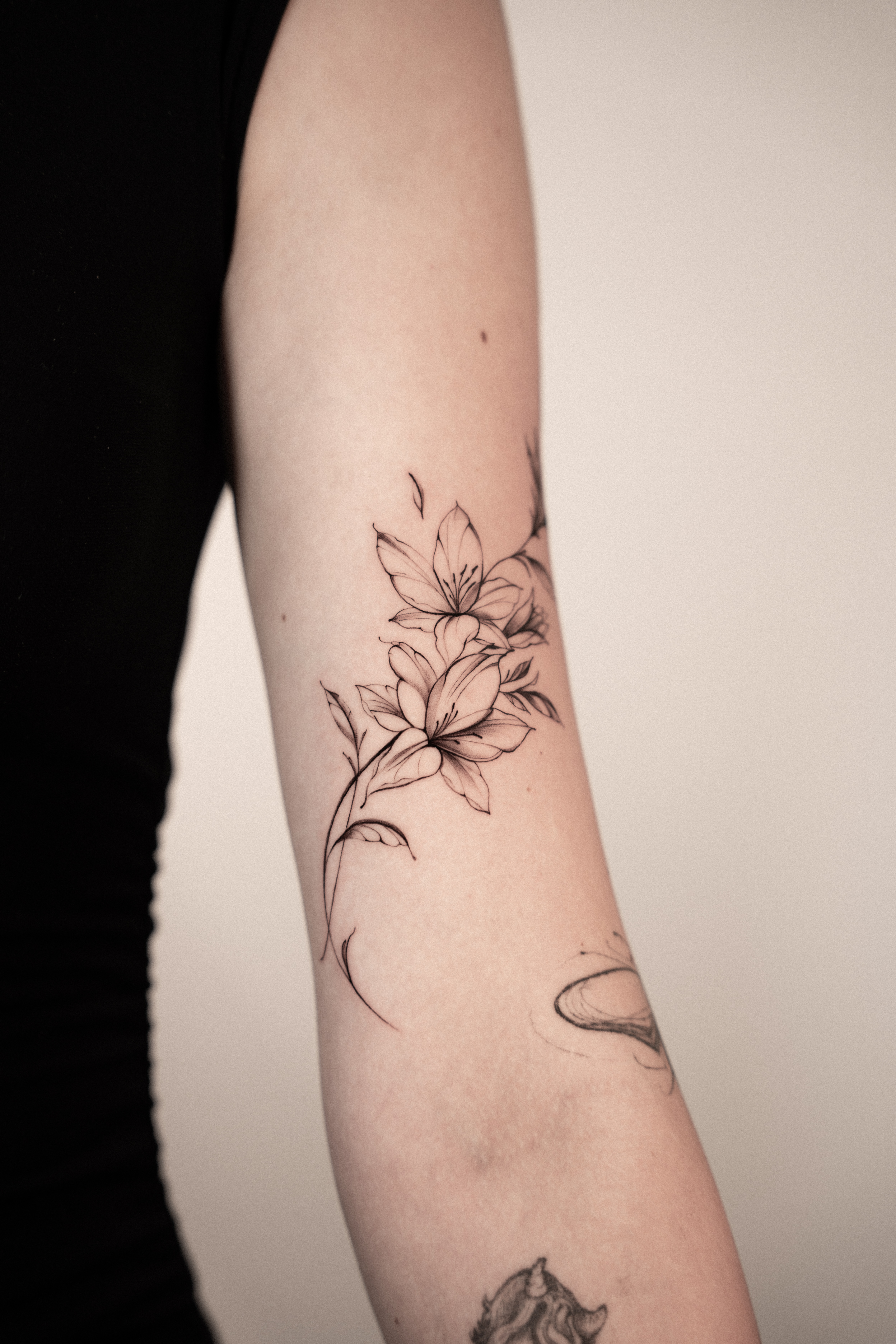
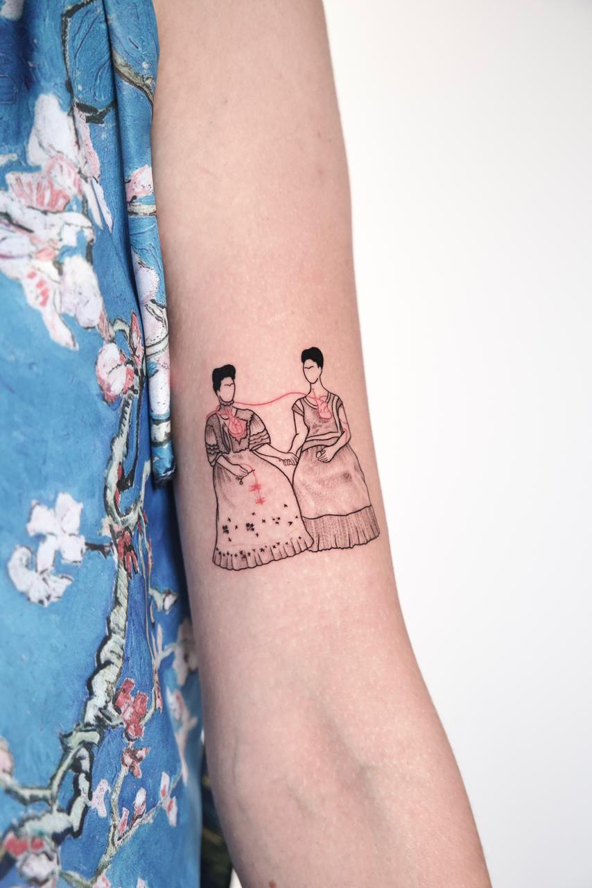
Across the collective, the work moves between black & grey, realism, fineline, microrealism, geometry, dotwork, illustration and color — each approached through the distinct visual language of the artist behind it.
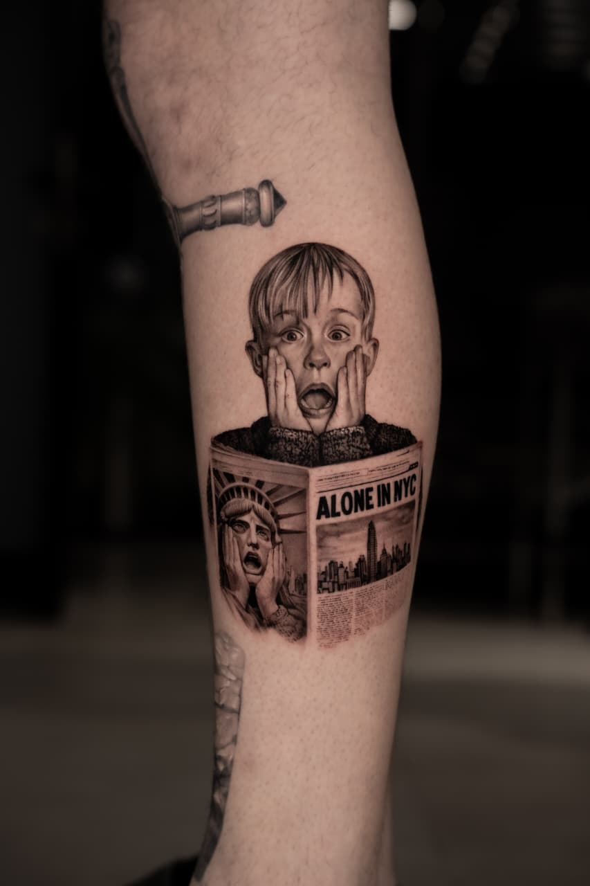
Some pieces are built at scale, shaped over hours or multiple sessions through layers of contrast, texture and detail. Others exist within only a few centimeters of skin, where every line becomes visible and precision leaves nowhere to hide.
Some begin with reality — a face, a photograph, an object, a place. Others begin with drawings, symbols, references or fragments of an idea that become something entirely new in the hands of the artist.
The approach changes with every piece.
The principles don't.
Made for the body
A tattoo is never just an image.
Scale, proportion, movement and placement are part of the composition from the beginning. A design has to make sense not only on a screen or a sheet of paper, but on the body it will live on.
A curve can determine where a line falls. Negative space can become part of the image. A few centimeters in either direction can completely change the balance of a piece.
The body isn't simply where the work ends up.
It's part of the work.
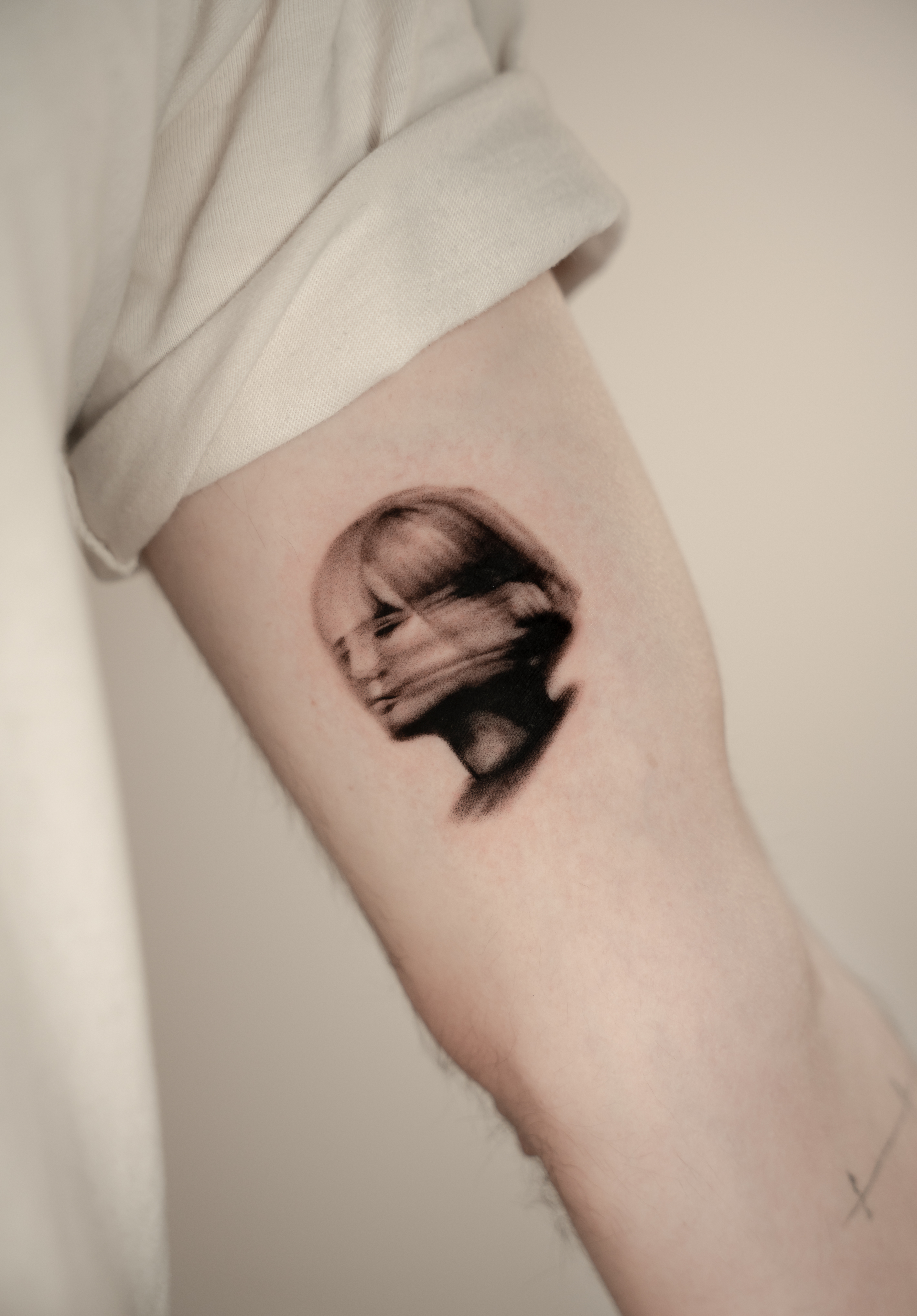
Detail with purpose
More detail doesn't necessarily make a better tattoo.
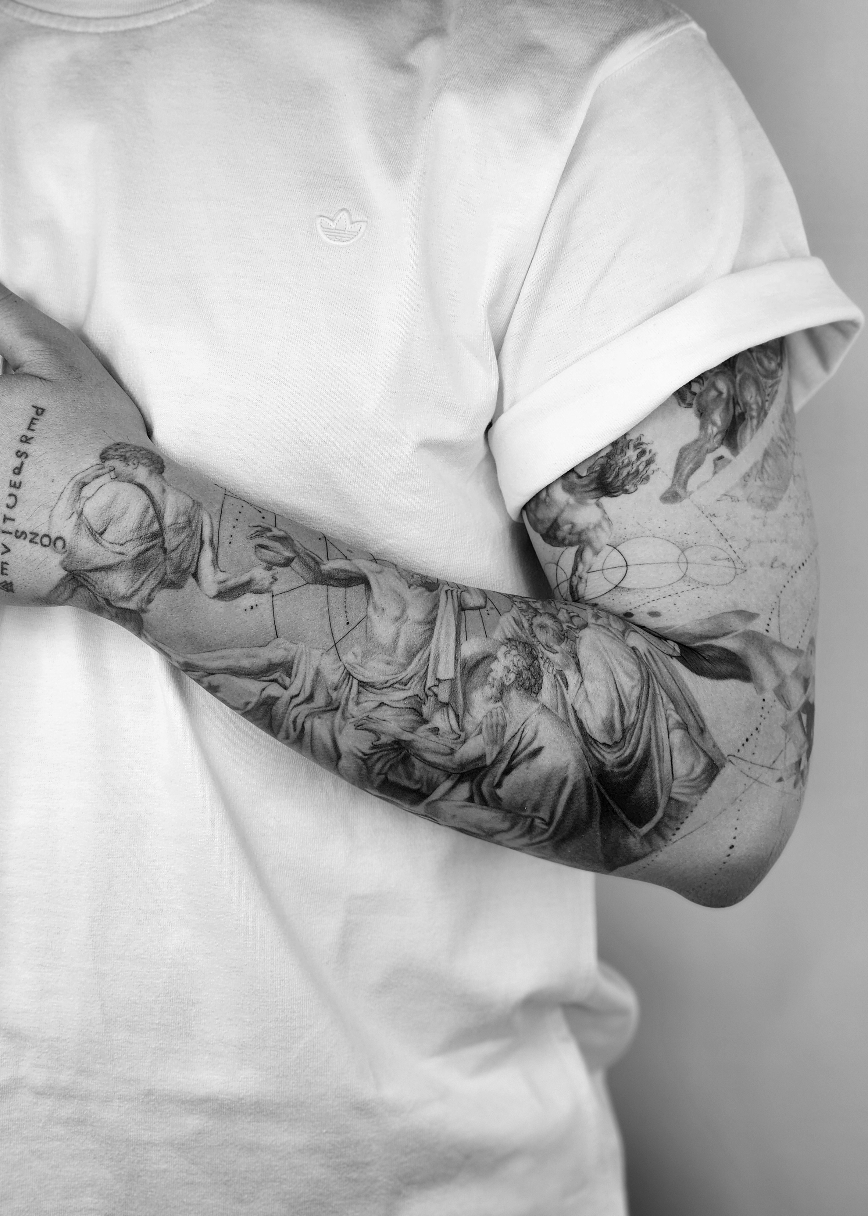
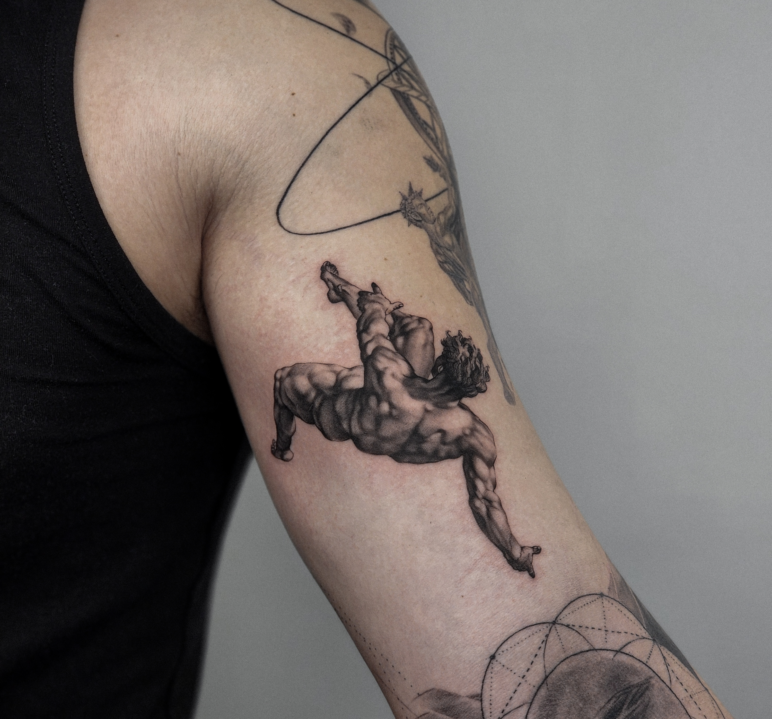
Sometimes the work demands complexity — layers of shadow, texture and minute elements that reveal themselves the longer you look.
Sometimes the strongest decision is knowing what to leave out.
That same consideration exists whether the piece covers an entire arm or disappears beneath a sleeve. Every line, shadow and empty space should have a reason to be there.
Because scale changes.
The attention doesn't.
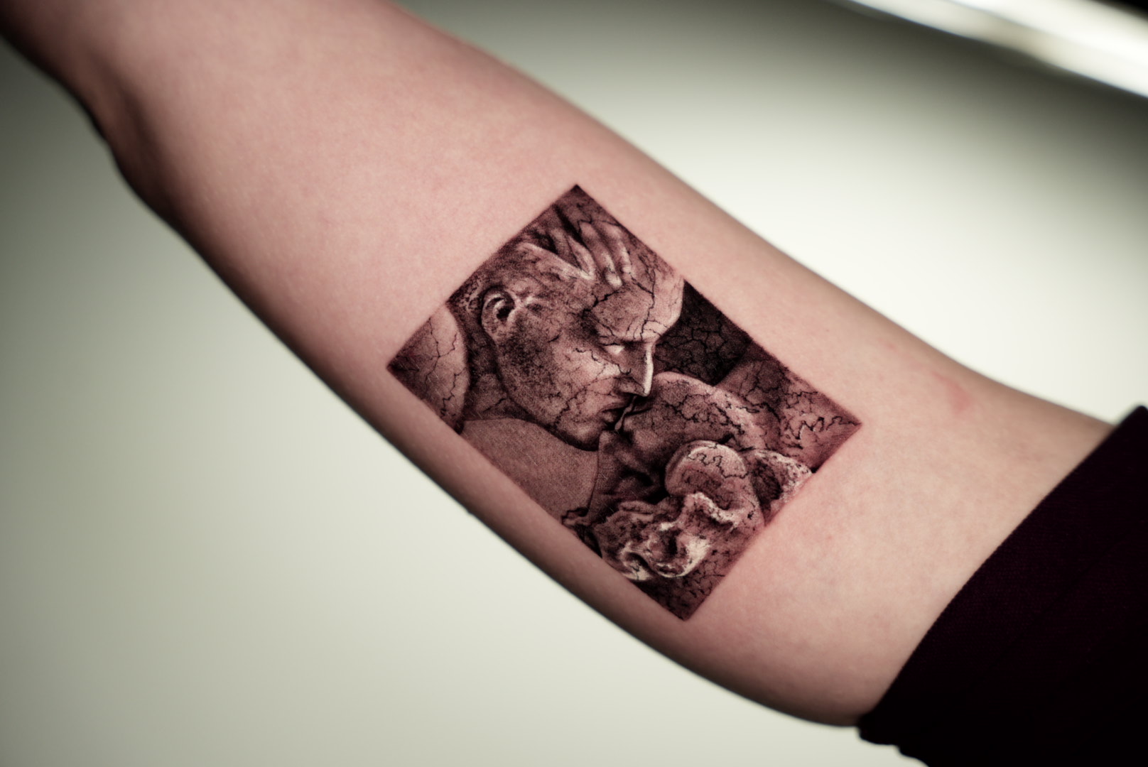

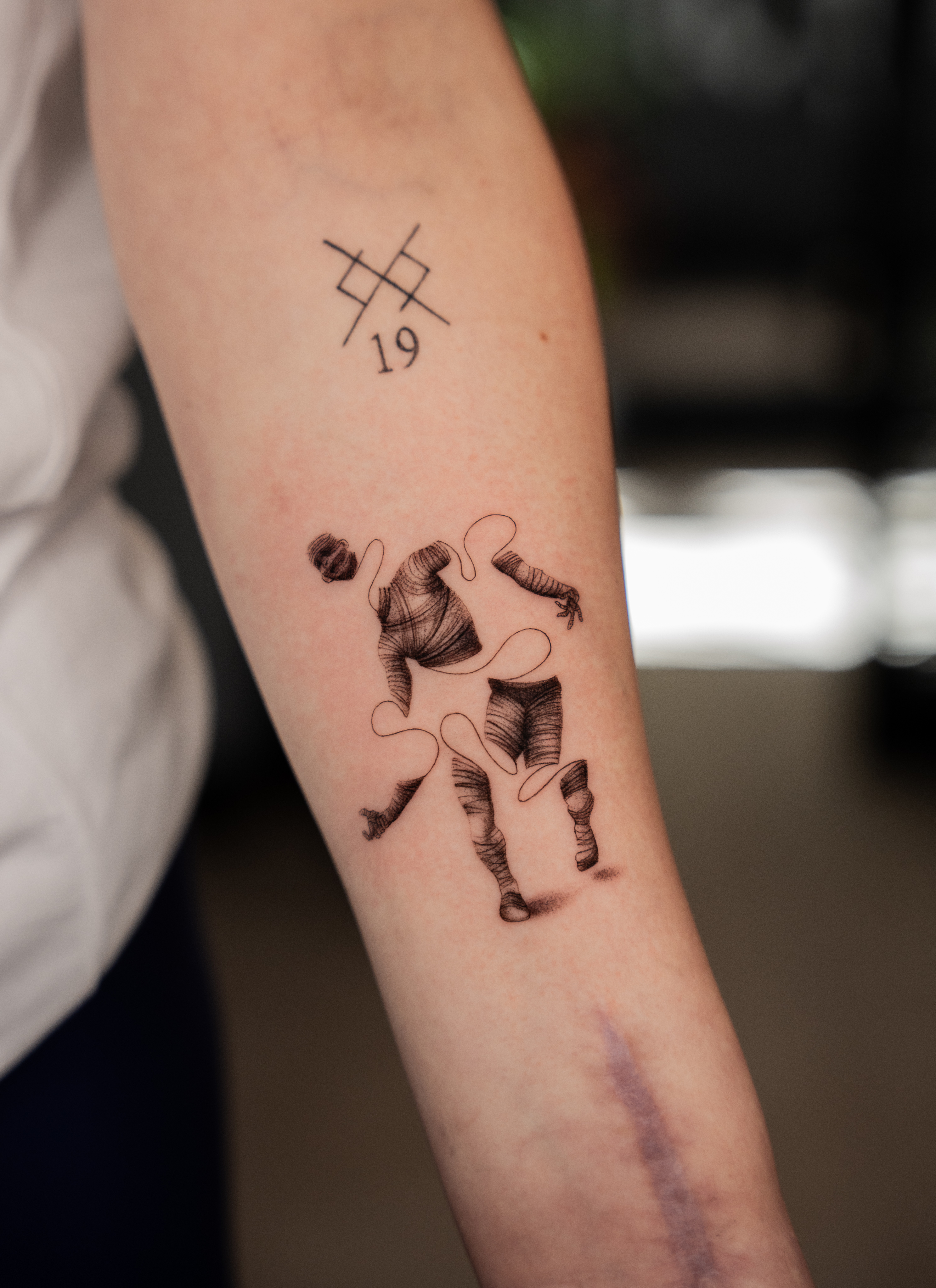
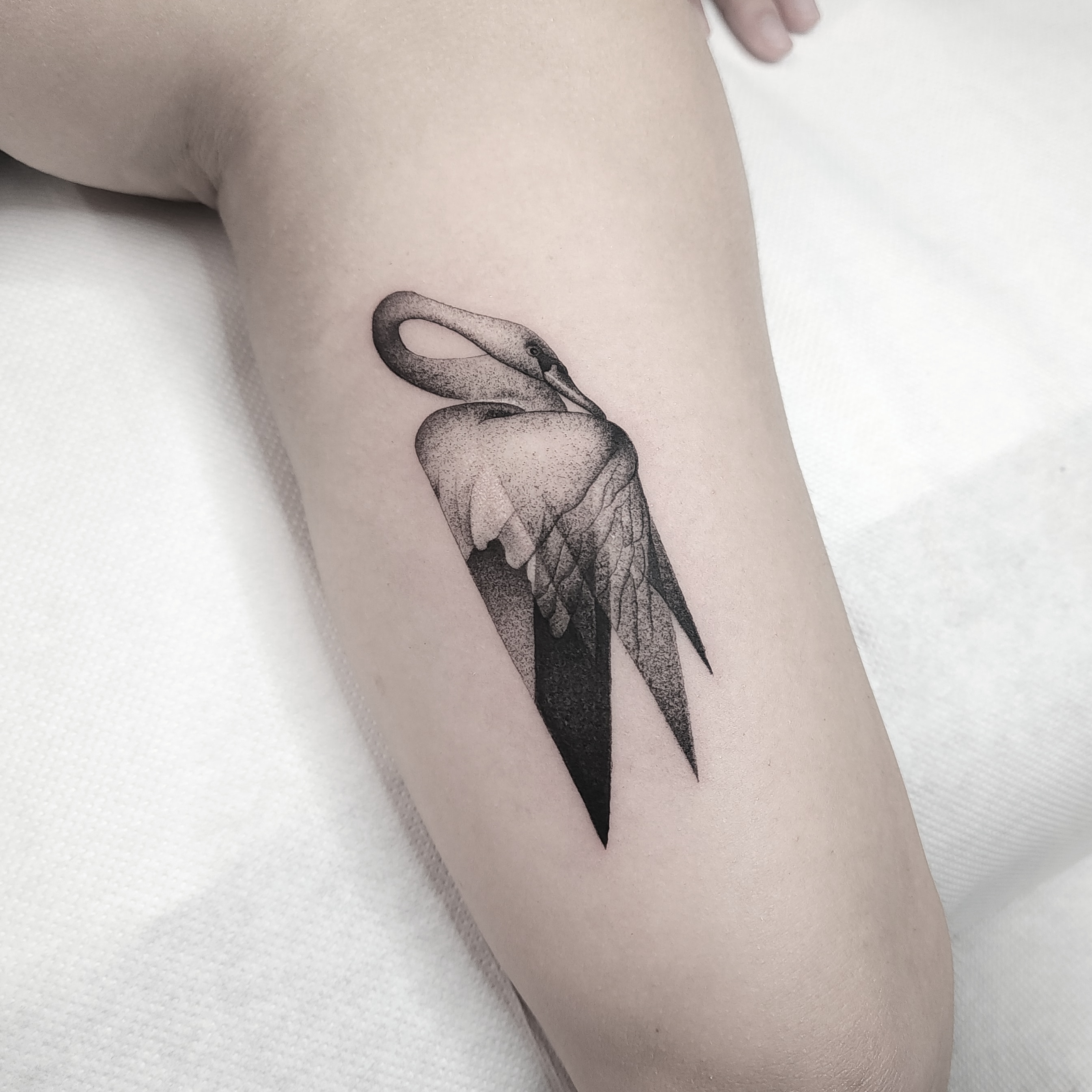
One collective. Many languages.
What makes the Heavy Ink portfolio cohesive isn't that every tattoo looks alike.
It shouldn't.
Each artist brings a different hand, discipline and perspective to the work. Realism can sit beside illustration. Fine lines beside heavy contrast. Precise geometry beside something loose, expressive and unexpected.
The individuality of those approaches is what gives the portfolio its range.
No formula. No single house style.
Just work made with intention, designed for the person wearing it, and created to exist far beyond the moment it leaves the studio.
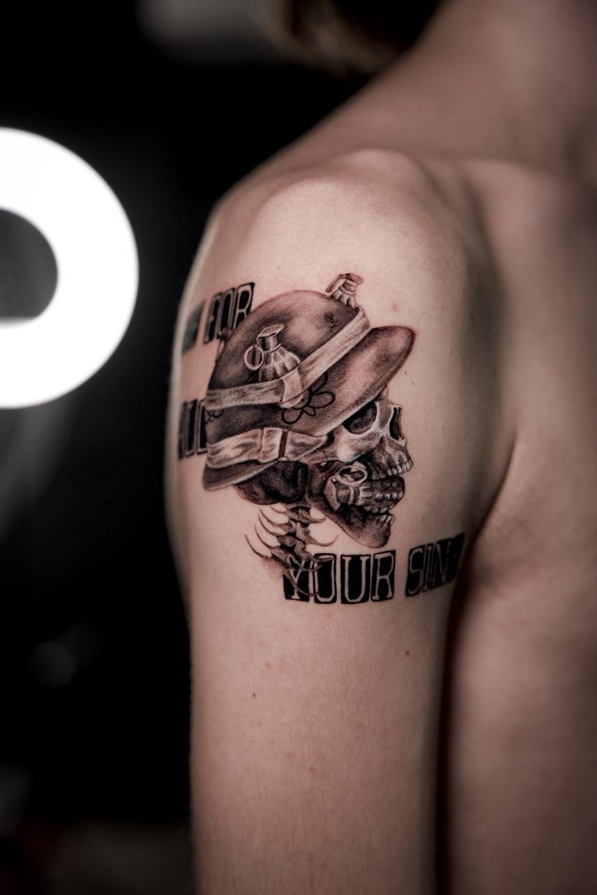
Different hands. Different languages. Made to last.